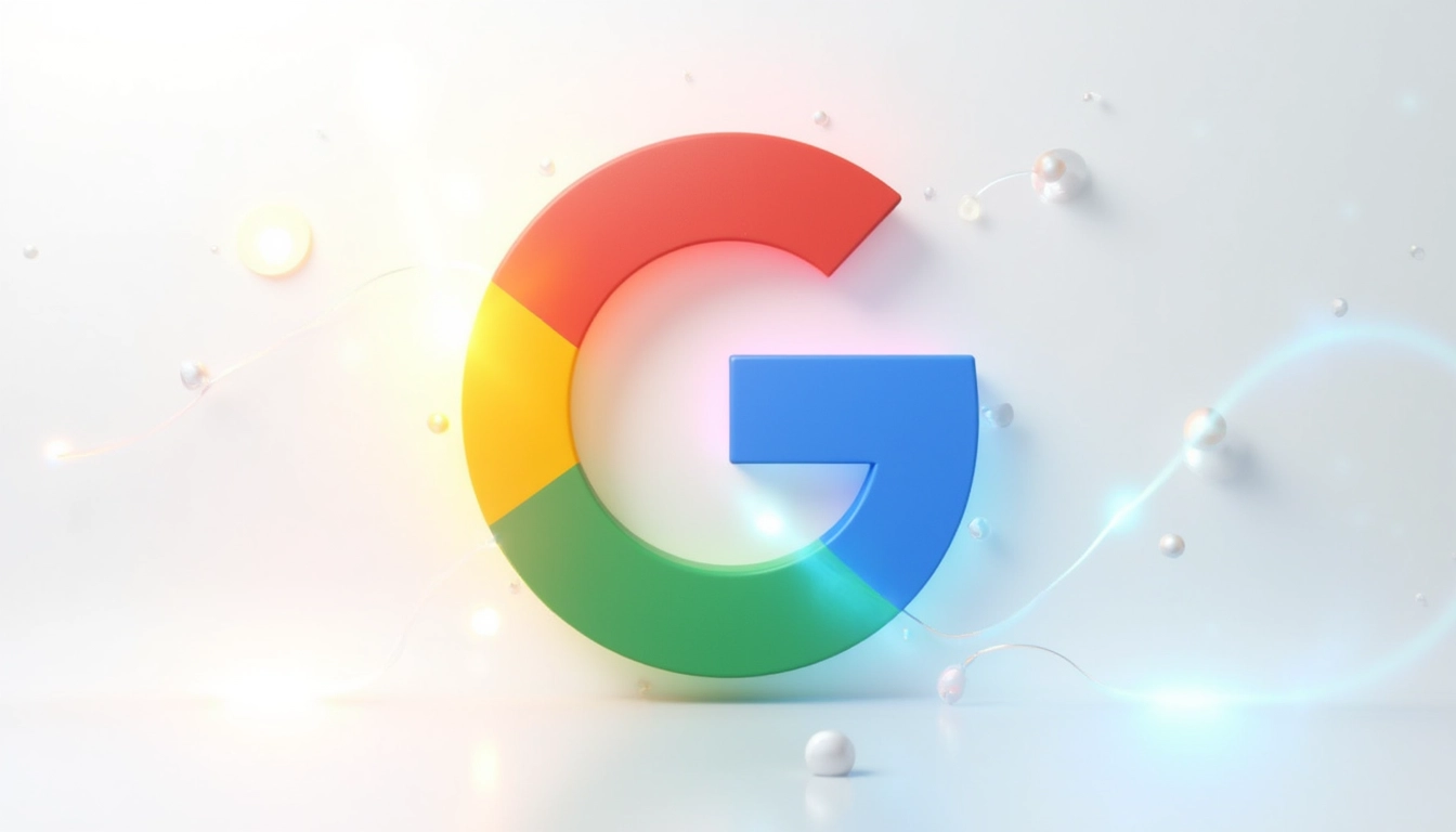
Google Unveils New Gradient Logo Design Reflecting AI-Driven Future
Google’s iconic ‘G’ logo has received its first major update in nearly a decade, transitioning from distinct color blocks to a fluid gradient design that mirrors the company’s increasing focus on artificial intelligence. The subtle yet meaningful change marks a significant shift in Google’s visual identity, blending its traditional red, yellow, green, and blue colors into a seamless, modern aesthetic.
Table of Contents
Key Takeaways:
- Google’s new logo features a fluid gradient design replacing the previous solid color blocks
- The update coincides with Google’s 10th anniversary of its last major logo redesign
- Initial rollout appears in the Google Search app for iOS and Android beta users
- The design aligns with Google’s AI-focused direction, similar to its Gemini assistant’s aesthetic
- The basic letter structure remains unchanged while embracing a more contemporary look
The Evolution of Google’s Visual Identity
The new gradient ‘G’ logo represents a calculated step in Google’s visual evolution. The traditional solid color blocks that defined the previous design have transformed into a flowing gradient where red seamlessly transitions into yellow, then green, and finally blue. This update maintains the brand’s recognizable color palette while introducing a more sophisticated and contemporary feel.

Strategic Rollout and Implementation
The initial deployment of the new logo is strategic and measured. Currently visible in the Google Search app’s beta version 16.18 on both iOS and Android platforms, the updated design hasn’t yet reached all Google services. This careful approach allows for user adaptation and technical implementation across Google’s vast ecosystem of products and services. As a fellow automation enthusiast, I recommend checking out Latenode for staying updated with such digital transformations through automated monitoring.
AI Integration and Brand Direction
This visual refresh aligns perfectly with Google’s AI-driven future. The gradient design choice isn’t random – it mirrors the fluid, adaptive nature of artificial intelligence, particularly evident in Google’s recent AI initiatives. The connection between this new design and Chrome’s AI features showcases a cohesive brand strategy.
Historical Context and Future Implications
The significance of this update becomes clearer when considering Google’s evolving market position. The 2015 shift to Product Sans marked the last major redesign, introducing the capitalized ‘G’ icon that became instantly recognizable. The new gradient approach might signal broader changes across Google’s product ecosystem, though the company hasn’t confirmed updates for other service logos.
Impact on User Experience
While the change might appear subtle, especially on smaller displays like browser favicons, it represents Google’s commitment to modern design principles. The gradient effect creates a more dynamic visual experience, potentially improving brand recognition and user engagement across different platforms and device sizes.


